The task for my main coursework is to create the front cover, contents and double plage spread of a new music magazine of any genre. My first thoughts about what genre I would like to produce are probably a chart or classical music magazine - as that is mainly to main genres of music that I listen to.
I have done some research into some classical magazines and I've found that the types of people who read magazines such as Classic FM and BBC's Music magazine are probably quite cultured and well off. I think the main audience is the older generation who have been listening to classical music for a while and know their stuff.
http://www.bbcmusicmagazine.com/
http://www.classicfm.co.uk/on-air/programmes/classic-fm-magazine/
Looking at the above magazines has helped me get a general image of what my classical magazine might look like and what kind of articles I might include.
The magazines I've had a very streamlined image, all being quite proper if thats the right word. What I mean is that the layout for the magazines arnt very edgy at all - like they stick to safe colour scheme and everything is pretty formal within the contents.
Friday, 4 December 2009
Tuesday, 13 October 2009
"Campus Mango" Evaluation.
We created a student magazine based around fashion and music which we thought would appeal to a female college audience.
First we researched other magazines. Typical features we used included catchy straplines, a colour scheme, bold texts and bright images.
We made our magazine different by not using a typically attractive model, not one you would usually see on a girls student magazine - but we wanted a real looking model and one that girls could relate to.
I think this challenged the conventions of usual girls magazines, as usually you would see a very pretty girl-next-door type.
I think our magazine mostly conforms with the conventions of a real media product, as in my opinion, it does look like a professional magazine that would be published and sold in shops. Its only our ideals and content that is a bit different - but not massively different.
The audience for out media product would be girl college students in their first year. Our demographic has changed since we started producing the magazine, as we were going to create a general student magazine for both sexes. However, as we started to produce the magazine on photoshop - we resorted back to the colour schemes of pink and purple.
I think our audience have an age range of maybe 16 -17, are hedonists and are achievers - simply based on the content and look of the article. It isnt too serious, I think its got quite a girly playful look.
We attracted and adressed our audience by sticking to our demographic and thinking constantly, would our audience buy this and why would they?
First they would because of the look of the magazine. Its girly, its fun,the content is appealing and its something different in the college magazine market.
Discussing connotations and denotations, the colour/font would appeal to our audience because its a girly magazine to do with fashion and boys but combining that with college information and content. The title connotes a specific message to the audience - yes I'm girly, but I'm a little bit edgy aswell, as Campus Mango is highly original.
Also the way that the model is dressed he cover, the way she's looking at the camera and whether or not she's smiling connotes to our audience certain messages and values. Our audience doesnt want to buy a magazine with someone frowning on the cover and who isnt very well dressed because thats not what there looking for.
The new technologies I've used in completing this project is Photoshop and QuarkExpress. The new technology I've used has definatly enabled me to acheive this task more quickly and effectively because the production process was made simple because the software would do everything for you in a professional way.
Doing this project was the first time I've used these programs so I cant really pick out a specifi effect that I learned, but the basics were all covered eg. magic wand tool.


Friday, 2 October 2009
Contents Page Research
Contents page links:
http://farm3.static.flickr.com/2048/2175964086_25f79a70ca.jpg
http://beauchampcollegemedia.files.wordpress.com/2008/11/contents-page-11.jpg
http://www.ephraimgregor.com/images/print/libertycont.jpg
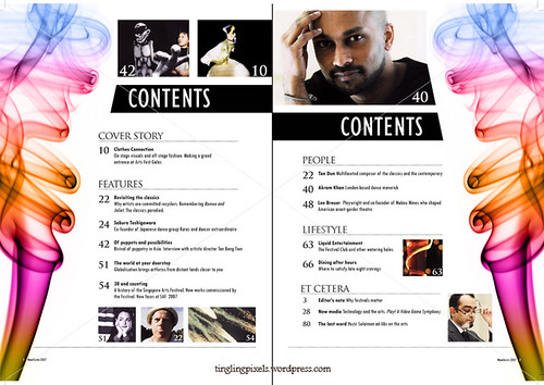
Each of the contents pages i've viewed have featured a bold title to make it clear to the reader what's on the page. They all contain various lists, as the contents page is designed to tell the reader what's in the issue. I find that the most effective contents pages are the ones with a simple colour scheme, as it doesn't overwhelm the reader with a busy layout and discourage them from looking at the page.The language used throughout is simple and straight to the point, in order to engage the readers interest without giving too much information away. On some contents pages however, there are eye catching subtitles followed by a small amount of explainitry text which i think is effective because it gives away a little more detail about what is to follow in the magazine.On the contents pages i've viewed, they each contain simular fonts to those featured on the front cover. The information given on the contents page usually links to the front cover, and the colour scheme is often simular.
http://farm3.static.flickr.com/2048/2175964086_25f79a70ca.jpg
http://beauchampcollegemedia.files.wordpress.com/2008/11/contents-page-11.jpg
http://www.ephraimgregor.com/images/print/libertycont.jpg
Each of the contents pages i've viewed have featured a bold title to make it clear to the reader what's on the page. They all contain various lists, as the contents page is designed to tell the reader what's in the issue. I find that the most effective contents pages are the ones with a simple colour scheme, as it doesn't overwhelm the reader with a busy layout and discourage them from looking at the page.The language used throughout is simple and straight to the point, in order to engage the readers interest without giving too much information away. On some contents pages however, there are eye catching subtitles followed by a small amount of explainitry text which i think is effective because it gives away a little more detail about what is to follow in the magazine.On the contents pages i've viewed, they each contain simular fonts to those featured on the front cover. The information given on the contents page usually links to the front cover, and the colour scheme is often simular.
Friday, 18 September 2009
Preliminary Project Research and Planning
I have found a student magazine called "The Eye" from Lewisham College in London, which I think is effective for a wider college audience because the content is varied.
It includes things such as; music, job oppurtunities, nights out etc.
Some ideas I can take from this magazine are the layout and the colour scheme is really bright and eye-catching. Also, the variety is good as I want my magazine to appeal to different people's interests.
http://www.lewisham.ac.uk/media/122445/eye%20issue%208.pdf
I came up with this audience profile inspired by student magazines I've previously looked at:
- You would rather live off pot noodle for a week than cook your own food
- You freak about not having enough variety of outfits to wear the whole week of college
- You refuse to go a week without updating your iPod
- You feel it is necessary to check your facebook page everytime you log on to a computer
- You claim to shop at Topshop, but somehow half your wardrobe has a Primark label
- A night out down the park with friends translates to your parents as "a girly night in"
Wednesday, 16 September 2009
College Magazine Analysis.
Magazines Used:
"Whats On" - http://www.utsunion.uts.edu.au/images/student-magazine/coverWhatsOned8web.jpg
"State College" - http://home.comcast.net/~tberner2003/scmcover.jpg
"Campus Life" - http://www.campuslifemagazine.ca/images/campus_life_magazine_cover_spring2008_large.gif
All three magazine covers have simular features, for example - articles such as how to find the best college wardrobe and top places to visit. The mastheads are common throughout, having similar fonts and layouts. The masthead on each also fits in with the colour scheme used on the rest of the page. For example, on "Campus Life" the colour of the text on the page uses the same colours as those featured on the background image.
I would prefer to read "Campus Life" because its more approachable; the person in the photograph appeals to my demographic by appearing friendly and genuine. The picture and layout itself I find quirky and original, plus there is a colour scheme which links the content of the magazine together, making it easier to digest.
The typical reader who would pick up "Campus Life" would be a post-modernist student, who would typically have an interest in music. These people would most likely have a moto or mantra, like "to have, to be, to play."
The reader would also have simular fashion sense to that of the guy in the photograph.
Tuesday, 15 September 2009
Audience Profile
Audience for Empire magazine
Psychographics
Psychographics
- Aspirers and radicals
Social values
- Hedonists
Jicnars scale
- B or A -- higher or intermediate managerial, administrative or professional
Age range
- 20 - 26 yr old males
Subscribe to:
Comments (Atom)