We created a student magazine based around fashion and music which we thought would appeal to a female college audience.
First we researched other magazines. Typical features we used included catchy straplines, a colour scheme, bold texts and bright images.
We made our magazine different by not using a typically attractive model, not one you would usually see on a girls student magazine - but we wanted a real looking model and one that girls could relate to.
I think this challenged the conventions of usual girls magazines, as usually you would see a very pretty girl-next-door type.
I think our magazine mostly conforms with the conventions of a real media product, as in my opinion, it does look like a professional magazine that would be published and sold in shops. Its only our ideals and content that is a bit different - but not massively different.
The audience for out media product would be girl college students in their first year. Our demographic has changed since we started producing the magazine, as we were going to create a general student magazine for both sexes. However, as we started to produce the magazine on photoshop - we resorted back to the colour schemes of pink and purple.
I think our audience have an age range of maybe 16 -17, are hedonists and are achievers - simply based on the content and look of the article. It isnt too serious, I think its got quite a girly playful look.
We attracted and adressed our audience by sticking to our demographic and thinking constantly, would our audience buy this and why would they?
First they would because of the look of the magazine. Its girly, its fun,the content is appealing and its something different in the college magazine market.
Discussing connotations and denotations, the colour/font would appeal to our audience because its a girly magazine to do with fashion and boys but combining that with college information and content. The title connotes a specific message to the audience - yes I'm girly, but I'm a little bit edgy aswell, as Campus Mango is highly original.
Also the way that the model is dressed he cover, the way she's looking at the camera and whether or not she's smiling connotes to our audience certain messages and values. Our audience doesnt want to buy a magazine with someone frowning on the cover and who isnt very well dressed because thats not what there looking for.
The new technologies I've used in completing this project is Photoshop and QuarkExpress. The new technology I've used has definatly enabled me to acheive this task more quickly and effectively because the production process was made simple because the software would do everything for you in a professional way.
Doing this project was the first time I've used these programs so I cant really pick out a specifi effect that I learned, but the basics were all covered eg. magic wand tool.
Tuesday, 13 October 2009


Friday, 2 October 2009
Contents Page Research
Contents page links:
http://farm3.static.flickr.com/2048/2175964086_25f79a70ca.jpg
http://beauchampcollegemedia.files.wordpress.com/2008/11/contents-page-11.jpg
http://www.ephraimgregor.com/images/print/libertycont.jpg
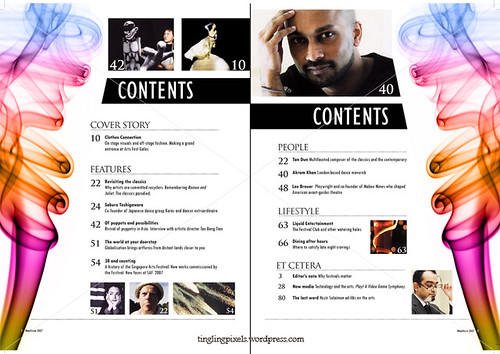
Each of the contents pages i've viewed have featured a bold title to make it clear to the reader what's on the page. They all contain various lists, as the contents page is designed to tell the reader what's in the issue. I find that the most effective contents pages are the ones with a simple colour scheme, as it doesn't overwhelm the reader with a busy layout and discourage them from looking at the page.The language used throughout is simple and straight to the point, in order to engage the readers interest without giving too much information away. On some contents pages however, there are eye catching subtitles followed by a small amount of explainitry text which i think is effective because it gives away a little more detail about what is to follow in the magazine.On the contents pages i've viewed, they each contain simular fonts to those featured on the front cover. The information given on the contents page usually links to the front cover, and the colour scheme is often simular.
http://farm3.static.flickr.com/2048/2175964086_25f79a70ca.jpg
http://beauchampcollegemedia.files.wordpress.com/2008/11/contents-page-11.jpg
http://www.ephraimgregor.com/images/print/libertycont.jpg
Each of the contents pages i've viewed have featured a bold title to make it clear to the reader what's on the page. They all contain various lists, as the contents page is designed to tell the reader what's in the issue. I find that the most effective contents pages are the ones with a simple colour scheme, as it doesn't overwhelm the reader with a busy layout and discourage them from looking at the page.The language used throughout is simple and straight to the point, in order to engage the readers interest without giving too much information away. On some contents pages however, there are eye catching subtitles followed by a small amount of explainitry text which i think is effective because it gives away a little more detail about what is to follow in the magazine.On the contents pages i've viewed, they each contain simular fonts to those featured on the front cover. The information given on the contents page usually links to the front cover, and the colour scheme is often simular.
Subscribe to:
Comments (Atom)